By John Carter

Hi Net Neighbors! Welcome back to Tech Tuesday, where we talk about the issues that interest you. As promised, this week we are going to look at the National Novel Writing Month, NaNoWriMo, which encourages people to write a novel in a month. And while I know it may sound crazy to some, there are a great many people out there who are already three thousand words into their work. But let’s say you don’t know where to start. Maybe you have an idea but the thought of getting it onto paper feels impossible. If you find yourself in these categories, then I have some tools for you that can help. Because sometimes the hardest part of the story is getting it plotted out.

Now today I am going to focus on two programs in particular, Microsoft’s OneNote and Word. I will give some alternatives, but these have two key factors leading to my suggestion. Factor one, be it business, personal, or through an education institution, nearly everyone has access to Microsoft Office. This large-scale access to the product means there are many resources online from which you can pull. Factor two, no matter the ecosystem or platform, if you have a connection to the internet you have the ability to use OneNote absolutely free. But before we get there, there is one pre-requisite we need to discuss, a Microsoft Account.

I’m not paying for Microsoft!

And I didn’t say you had to. Remember, whenever possible I try to find a low cost, high-use option for you. Microsoft, following Google’s model, has made online versions of its software available for free. All you have to do is go to Outlook.com and make yourself a free email account. From there you have access to Word, Excel, PowerPoint, and OneNote. Granted, if you want the pro options you will need to pay Microsoft at some point, or get your hands on Word through the other channels.

Word? What About OneNote?

Good eye. In order to bring its products to the widest market, Microsoft has made all versions of the OneNote product absolutely free. This means you can download the desktop version, the Windows 10 app, and the phone apps. And, because of your Microsoft Account, you also have OneDrive. Only 5GB of storage but for a book that is more than enough. So let’s get started with OneNote for the Web.

OneNote


Figure 1 – OneNote for the Web

So here we have an image of OneNote in your browser. Not too bad, eh? If you are familiar with any Office Product from the last eleven years this should look similar though different. In OneNote our central digital object is the Notebook. Picture what that means to you, that’s basically what you can make your Notebook into. I use OneNote for so many things but where I get the most use is in writing.

As you can see in the picture above, I have broken the Notebook into smaller sections. That is something I love about OneNote, all the levels of control and organization. Now for this Notebook, I have a section for the Book and within that section I have the book itself split into smaller pages. Each page uses one of the Header Styles which will make transferring it into Word a great deal easier.

Now OneNote can be used no matter how you like to plot out a book. Want to start at the beginning of it all and work your way to the end? Have at it. My advice is to break your text up into different pages. I like to break it at the scene level. I create a new page, title it something that makes sense (Don’t Forget to use Heading Styles!), then in the body of the page start typing.

As you begin typing, you will notice your text is placed into little containers. Think of them as sticky notes on a cork board. And they can be moved around just as easily. But I prefer to stay with one sticky note per page, even if it becomes a note that is three pages long.

The reason why you should stay with one scene per page is a simple one, in One Note you can move pages. In our image above, if you feel like Act 2, as you’ve written it, needs to move ahead of Act 1 you don’t need to worry about cutting and pasting. Instead you can just grab the page name and move it wherever you want in the order.

Also in this notebook are pages for Characters, World Building, Research and if you need more you can just add it. But the real key is that all your information is going with you. This is especially true if you use the OneNote app for iOS or Android. You can access your content from the app and update while on the go. Have a scene that needs to be written but no sure where it goes? Make a page, title it up with those Heading Styles, just stick it in its own area called “Cool Scenes”.

Why do you keep mentioning Heading Styles?!

Because they are powerful tools and because in Microsoft Office, they are more powerful than you can possibly imagine. Yes, that was a Star Wars reference. Let’s take a look at Microsoft Word.

Microsoft Word

Figure 2 – Word Desktop

If OneNote is a little esoteric for you, Word is always an option. Here in Word you can write your whole document, from start to finish. We’ll cover the finish next time but for now we can look at how to start it.

As you can see, I have made a quick Word document in a similar style as the OneNote Notebook I created, only this time it looks more like what you are probably used to. If you look, you will see that I have used Heading Styles for each of the parts in the book. Now you may notice that some of the content on the Left is indented compared to the rest. This is because I used the Heading 2 Style for those parts rather than the Heading 1. And if you look really close you can see a little black triangle next to the Book Work Heading, clicking this will allow you to collapse all the content inside.

Because of this, you can be writing a long novel but only see the part of the story you are working on. Everything else is hidden for the moment, ready for you to reopen it at a moment’s notice.

And let’s say you would prefer to organize your Book Work area with the order of Characters, Research, World Building. If you have not been using Heading Styles you may be preparing yourself to copy and paste the content. Instead, all you need to do is grab the appropriate heading, let’s say Characters, and drag it to where you want it. Because of Heading Styles, the computer will automatically move everything between that line and the next with the same Heading Style Level. If you have all your scenes using a Heading 2, 3, or 4 Style then you can just move the epic scene you wrote three weeks ago into it’s proper place, all without missing a period.

Of the major desktop publishing platforms I checked, Apple Pages, Google Docs, and Microsoft Word, Word was the only one I was able to do this with. Though, to be clear, only the paid desktop version can do this. Which is why I mentioned OneNote earlier.

What if I don’t want to use those?

Then you don’t have to. I just mention these because I use the heck out of them and can quickly make them do what I need.

If you would rather something not in the Microsoft Wheelhouse then I would recommend Scrivener. It does most, if not all that I mentioned today. And it has its own tricks that make it a compelling option. I personally do not use it only because I came upon it so much later in my writing. But I have been curious and might try it out, if only to give you all a better review down the line.

Anything else?

Certainly. There are as many ways to write a book as there are stars along the Hollywood Walk of Fame, maybe more. For today though, we are done. Stay tuned for next week where I show you how you can take your prose and get it into a format ready for e-publishing.

Until then, have fun, find adventure, and stay safe!
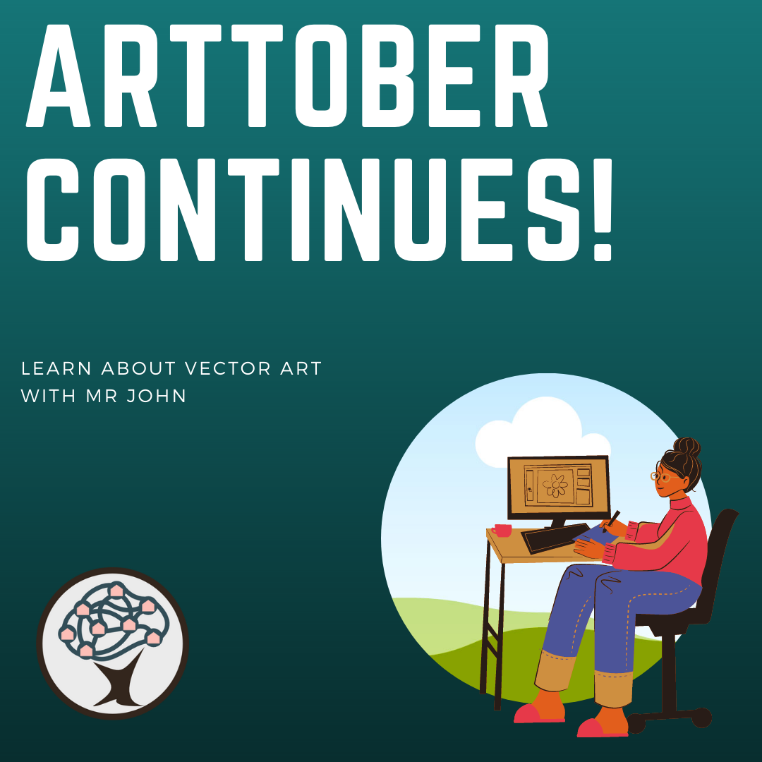
A woman at a computer with the words Arttober Continues! in the background

By John Carter

Hi Net Neighbors! Welcome to another Arttober Edition of Tech Tuesday, where we cover all the questions you have about Tech and the Digital World. This week we are continuing our Arttober work, moving away from Raster Art, which is moving pixels, and towards Vector Art. Now on the surface Vector Art can seem similar, if not identical to Raster Art. It is when we scratch the surface where we see differences crop up. Before we go into those differences though, let me give you an example of a vector object you may have seen. Do you have a favorite sports team? Regardless of where that logo is printed or displayed, somewhere it is stored as a vector object.

So what are Vector Objects?

As we covered before, a Raster Object is comprised of pixels. Pixels are limited by the sizing their parent image was created in. That is why you can only stretch a photo you’ve taken by so much before you start seeing the ‘smooth’ lines become jagged. In this way Raster Objects are true to life. Smooth objects are only smooth from our perspective. If you zoom in on a sheet of glass, you can start to see tiny grooves and roughness.

On the opposite side of the digital divide are Vector Objects. Whereas the parts of a Raster Object are collections of pixels, a Vector Object is a mathematically derived shape. Now I know many of you probably took a massive breath at the word math, but don’t worry you don’t have to know a single bit of math to work with Vectors. All the math takes place behind the scenes. You deal with Vector Objects all the time. Ever write an email, text, or document? If you have, all those letters on the screen are Vectors. Think about it for a moment. When you change the size of a letter from ten to twenty does the letter get jagged? No. They are smooth no matter the size. Because they are Vectors. If you deal with shapes in Google Docs or Microsoft Word, those are Vectors too.

Why do I want Vectors Objects though?

Are you making a logo? Do you want to be able to change the colors of an element with just a click? Or do you just want to do some art? All of these are possible when dealing with Vector Objects. Although you may not need them, logos are a perfect use case for these sorts of elements. With a logo you are generating an image that must look good on business cards, cups, hats, billboards, and airplanes. To achieve this with a Raster would require a file of positively huge proportions with regards to pixels. Meanwhile a Vector with a size of 1 inch by 1 inch, can be set to whatever size you want, and it will always look crisp and clean.

Sounds amazing! How can I get started?

As with Raster Art, there are many options available. So many, in fact, that were I to list them all I would be here for hours, and you would be very bored. Therefore, we are going to take a similar path to our prior lesson and focus on a handful of options and let you go from there. Along those lines, we are going to look at one paid, Affinity Design, and one free option, Inkscape. I have personally used both and find them excellent resources.

Affinity Design

If you are joining us from last week, you are sure to recognize the name Affinity. I wrote at length about Affinity Photo. Well Affinity Designer, also from Serif, is that company’s answer to Adobe’s Illustrator. Adobe is a massive competitor in the space and most people are playing catch up. This is especially true for Designer where there are several features that are just not there. However, these are not game breaking features. I would, instead, mark them as quality-of-life items. You can certainly get by without them and a great many people do, especially when you consider how Affinity is a one-time cost while Adobe is a subscription.

Designer has robust tools for handling a great many vector objects, the limits of which are dictated by the capabilities of your computer. You can take simple shapes such as squares, circles, and triangles and use them as building blocks for more complex objects. By arranging a circle next to a square, you can use the former as a cutting tool to take a semi-circular chunk out of the latter.

Within, though not limited to, Design, is a Pen Tool which allows you to create your own custom shapes and paths. Paths can be simple lines, but they can also be used as the basis for a Vector Brush. Vector Brushes allow you to create textured effects across the path’s length. So what started as a simple line can become a series of spots on the side of a jaguar.

Now where Designer really rises above the pack in its ability to use Raster brushes in Vector objects. With this, artists can create complex Vector images and then shade within each shape with the subtle granularity one may find in a traditional painting. A good place for something like this is in children’s books where I have seen it used to great effect.

Cost

Everything I have said about the cost of Affinity Photo is true in Design. Designer is paid product with a desktop cost of fifty dollars and an iOS version costing twenty-two dollars. For that cost though, you will have access to Designer through the entire 1.0 development cycle. Meaning that so long as the number is 1.something you will get those updates for free. You will also have access to your old versions of the product, so if an update to Designer does not work on your computer you can still use an older edition.

Ease of use

If you are familiar with using shapes in Microsoft Office or other Desktop Publishing Products then you will have a leg up here in Affinity Designer. There are plenty of tutorials online for you to access, though not as many as Adobe Illustrator. The good news there is that since many of the tools are the same you can use guides from one to play in the other.

Now in the Affinity Photo section from last week I said I wished I had interacted with the iPad version first. This week, I am going against that point. With Designer I find the ability to use a mouse far more useful than a pen input. Now if I was going to utilize the Raster Brushes as I mentioned earlier, I would certainly prefer a pen. Either way, Designer is a powerful tool regardless of the path you take.

Alternatives

As I have mentioned a few times, there are a few alternatives out there with the biggest being Adobe Illustrator. But since the cost of entry is so high, and your computer may not run it depending on the age of your machine, I recommend some alternatives. One is a possibility you may not have thought of before, Microsoft PowerPoint. Yes, you heard me, PowerPoint. With recent updates they have included many of the same tools with regards to editing and combining shapes as you may expect to find in other, higher-profile, programs. To get the most you are going to want to have Microsoft PowerPoint 2016 or later. You may already have that through your college, school, or other means but if you don’t there are still powerful alternatives for you.

My go-to one-hundred percent free alternative to Affinity Designer is a program called Inkscape. After playing with PowerPoint for a bit, Inkscape is where I went next. It is an amazing tool with pro-style features joined to a price point which is available to all. With recent updates Inkscape has become even better, giving the program a graphic overhaul to bring it more in line with what designers expect from a Vector Program. The only real downside is that there is no mobile version, making this a strictly desktop toy. Still, it is a great program, and I cannot heap enough praise on it.

Anything else?

As with anything art related, the amount of words one could expend on this topic is nearly infinite. Like last week, my intention was not to be wholly comprehensive but to instead expand your knowledge and point you in new directions. Vector Art can be a very rewarding endeavor and if that sounds like something you may be interested in then I suggest you take a look. Stay tuned for next week when we will be looking at the third part of our Arttober Series, 3D Art.

Until then, have fun, find adventure, and stay safe!